Designing more relevant product experiences for DIY and PRO customers: Product Information Page Redesign UX case study by Rita Omatsone
Redesigning parts of The Home Depot product page: three ways to navigate product details for DIY shoppers, and a PRO layout that brings specifications and manuals higher, shaped by prioritization workshops and customer testing.
- Role
- Sr. User Experience Designer
- Segments
- DIY and PRO customers
- Scope
- Product details navigation, information architecture, layout, image gallery
- Methods
- Prioritization workshop, RICE scoring, Dscout listening sessions, third-party testing with Good Growth
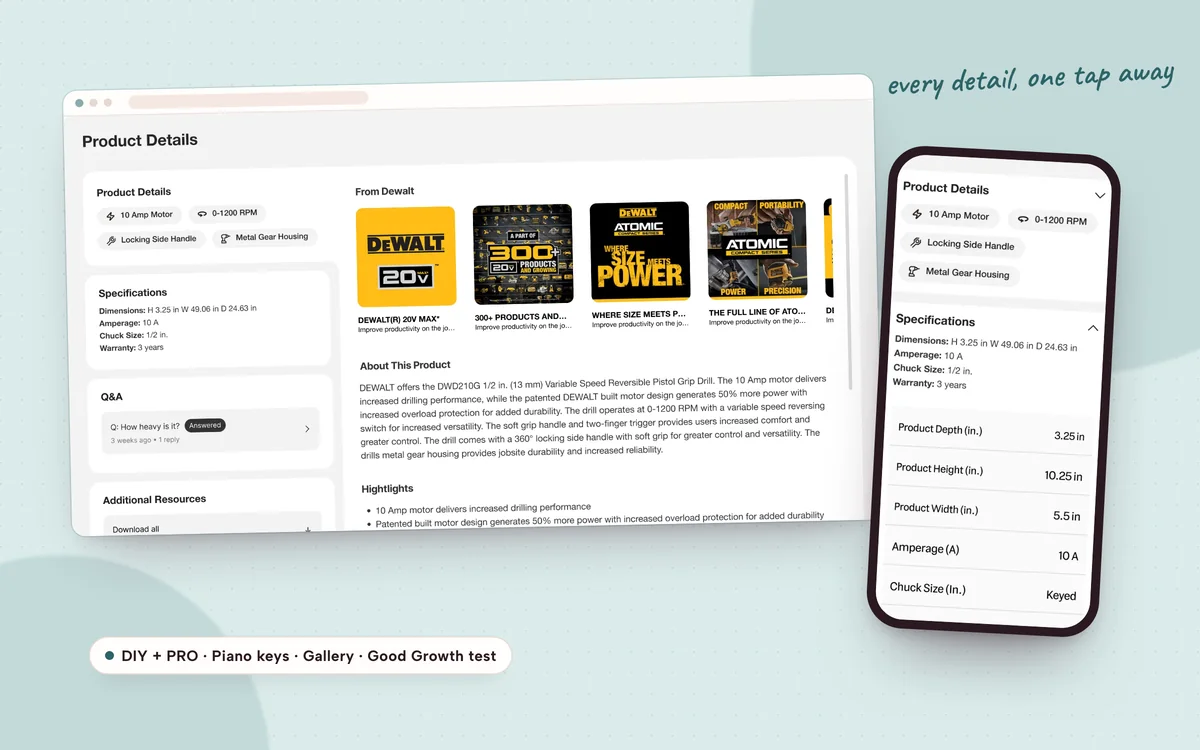
- 3 navigation patterns explored for product details
- 2 customer segments with their own page hierarchy
This case study is password protected
It includes confidential work. Enter the password from Rita’s application or email to read it.
Inside this case study
- The challenge
- Prioritizing what to work on
- DIY product details
- Validating with customers
- PRO product page
- Outcome & impact
- Reflection
That password doesn’t match. Check the email or résumé Rita sent you, or ask Rita for access.